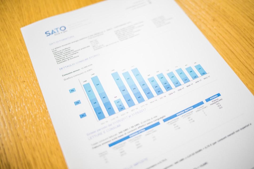
Column charts are used to compare values across categories. They are similar to bar charts, but the bars are vertical instead of horizontal. This makes it easier to see the differences between the values. Column charts are a good choice when you want to compare values for different categories. For example, you could use a column chart to compare the sales of different products in a store. On this page, you’ll learn all about these types of charts. Find out the advantages and disadvantages of column charts as well as when to use them below.
When to Use a Column Chart
Column charts are a great way to compare data points side by side. They are perfect for representing data that is divided into categories.
If you want to learn how to choose the right column chart, there are a few things to consider beforehand. You’ll want to think about the type of data you are representing, the number of data points, and the scale of the data. If you are representing data that is divided into categories, use a column chart. You should also use it if you are representing a small number of data points, representing a large amount of data, or representing data that has a large range.
Column charts can be used to compare and contrast data between two or more groups. They can be used to compare the size of the groups, the distribution of the data within the groups, or the relationship between the groups.
Advantages of a Column Chart
Column charts are also referred to as vertical bar charts. They’re used to compare data points or changes in data over time. They are often used to compare data sets of different sizes. And the height of the column represents the magnitude of the data point. Column or bar charts are often used when tracking changes and progress to see how they might affect other variables. They can easily show how a particular value changes over the course of a set period of time. And this can be helpful when trying to compare data or when trying to see how a trend has changed. Additionally, these charts can be used to compare information between different groups in order to figure out what works best.
Disadvantages of a Column Chart
Column charts are used to compare values across categories. They are similar to bar charts, but the bars in a column chart are oriented vertically. This is because they are often used to compare the size of different groups of data. However, column charts have a number of disadvantages. First, they can be difficult to read if there are a lot of data points. Second, they can be misleading if the data is not evenly distributed. Finally, they can be difficult to create if the data is not in a tabular format.
Types of Column Charts

There are three main types of columns: clustered, stacked, and bar charts. Clustered charts are the most common type. They are used when you want to compare the values of different categories. They are similar to bar charts, but they use columns to show the values instead of bars. This makes it easy to see the difference between the values in each category. Stacked charts are used when you want to compare the values of the same category over time. The columns are stacked on top of each other to show how much data is in each category. Bar charts are column graphs that are on their side. Sometimes, it’s just easier to understand when the data visualization is in this orientation.
Hopefully, this page has provided you with explanations about column or bar charts and how they help with different categories of data.

